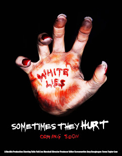
To create our final design we initially began by using the 'smudge' tool on PhotoShop to remove the 'coming soon' writing on the bottom of the palm as we felt that this ruined the image as it was too weak and it took away from the 'White Lies' impact. We then used a 'magnetic lasso' tool and selected around the hand, we inverted the selection so and then used a paintbrush tool and painted the background in black. This removed any imagery in the background and enhanced the black of the background. This makes the hand stand out more and leaves no other distractions to the hand itself. We then enhanced the brightness and contrast to make the shadows harsh and to make the center of the hand brighter. This again makes the hand stand out from the background as it is brighter. Using the 'scratch' font from 'dafont.com' we create the lettering. The initial lettering is quite messy and so we cleaned it up on PhotoShop using a paint brush tool in a separate document, as the writing was in black and the background was in white we inverted the colours to make the background black and the writing white. We altered the size of the writing by changing the size of the whole image to make it the correct size, we then selected 'Sometimes they' and dragged it over to the document with the image in it. We then enlarged the document again to make the writing even bigger and dragged 'Hurt' over and positioned it in the correct place. We then did the same thing with 'coming soon', opened a new document, pasted it over, simplified the lettering, inverted the colours, filled the letters in with red using a 'fill' tool after matching the colour with the blood on the hand, change the size of the document to make the writing small, and dragged the writing over to the document with the hand in it. For the final stage of our creation we used the 'text' tool and created our production and cast list using 'impact' font, we choose this font as it was simple and easy to read and could be small and still legible. We did this in a separate layer and moved it to the correct position and manipulated the size of the font.
No comments:
Post a Comment