As our genre is horror, we want to create a production logo that will suit this genre, seen in logo's such as 'Twisted Pictures', used by films like Saw.  This image is shown below and uses dark colours, which connotes death, evil and mystery as it is bold and hard to see through, which creates the fear of the unknown. The image is a nail with barbered wire round it, which is dangerous as it has the potential to hurt someone and can also be seen as a warning, as barbered wire is often used to protect something, or keep someone out.
This image is shown below and uses dark colours, which connotes death, evil and mystery as it is bold and hard to see through, which creates the fear of the unknown. The image is a nail with barbered wire round it, which is dangerous as it has the potential to hurt someone and can also be seen as a warning, as barbered wire is often used to protect something, or keep someone out. Our image that we have created consists of an eye looking through a keyhole. Our i mage is very dark and uses charcoal effects on photoshop with a hint of red to create an old worn look, we have manipulated the colour to make it sepia, this colour connotes danger and the 'old' look also enforces the fear of the unknown as we are unaware of what happened as we weren't there to experience it. The concept of someone looking through a keyhole represents the fear of the unknown and being forbidden. The audience also feels like they are unaware of what is happening as they don't know who is looking into the hole and what is behind the hole. It makes the audience feel uneasy as they feel asif they are being watched as the eye looks directly into the camera. This makes the audience connect with the image as they look back into the eye. Creating this logo has given me an insight to the production world. It has also helped me to create synergy with the genre and every aspect of the trailer. When we decided to show our initial logo to our peers and gained feedback, alot of people said that they felt that they could not see what the image behind the keyhole was. (shown to the right)
 We then decided to change our image and make sure that the eye in our logo could be instantly recognised. We took another photo of my eye and ensured that it was a clear image that we could use, which is shown to the right. We then manipulated the photo on photoshop by using our previous idea. Instead of using the charcoal filter we decided to use the filter 'Sumi-e', which is similar to 'fresco' but gives a less texturised effect, therefore making the image more clear. We also manipulated the curves, brightness and contrast and the levels of the image to make it more striking. As shown below the original image.
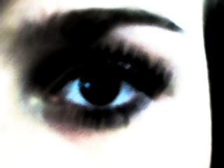

Through our research we came across various styles of distribution and production logos. From this research we could see what was most effective, and why and how it was. We could see that the production logo often reflects the genre of the film that it is creating, therefore attracting a target audience through their logo. As we have decided to create a film that is in the genre of horror we have decided to create a logo that portrays this. Therefore we have planned to call our Production company 'Hostile Productions'. By calling our production company 'Hostile Productions' it implies anger, or solidarity. This is the final production logo that myself and Ferne have created. We feel that this logo is the most effective as you can see that it is an eye, and that it is looking through a keyhole. By using a brush with less definition it makes it appear that we have included a depth of field and is almost like a photograph. The contrast in the image makes it more striking and this will draw the attention of the audience in. We have used a typewriter font that is often used for horror films, we have altered the lettering so that some of the letters are wonky this makes it more interesting and unusual.
No comments:
Post a Comment