We used a bedroom in my house to film this scene and removed all objects that gave any sign of humanity and serenity, such as a picture frame and a chess piece. The room is beige and gives a lifeless feeling to it. We turned off the lights to create a sinister atmosphere and used a lamp in the corner of the room to still ensure there is light in the room, although we can edit this on adobe premier.We have used a domestic setting as we found through our research that the majority of our target audience found a domestic setting scary and they found a story line they can relate too was scary, therefore by using a bedroom with typical furniture in it, our audience will be able to relate to it better. As it is a domestic setting the area is safe and there is no potential fire hazards or areas in which people could trip up or hurt themselves. We should be careful moving things around the bed as on the left hand side it does become quite narrow and we could potentially fall over. As the lighting will be low we should also ensure there is nothing that could trip us up. We will be filming at night so there will be no natural lighting, all light included will be artificial and created by the lamp in the right hand corner. We plan to cover this light with a cloth and therefore should ensure that it is not there for a prolonged period or too close to the light bulb to prevent possible fire hazards. As it is a domestic setting we have control over any unexpected sounds and there is limited interruption from the outside, weather will not majorly influence our filming time either.


Wooded location:
These are images from our location for the shots in which Sophie is running away from Bowe in the woods. We have chosen a small wooded area as we decided that we don't need a large area as the clips we will be using are only short. Although we will be filming in the dark and you wont see much of the surrounding setting we feel that this location is ideal as there is no interruption of roads of bright lighting but it isn't as dark as the woods so therefore we will have ideal lighting. There is a pathway that runs through this woods this will give the actor and actress a clearing in which they can run with out tripping up. By using an outdoors wooded setting we are appealing to our target audience as quite a few said that they would find this a scary setting. We should ensure we check all areas before using it for any sharp objects for example needles, if there is any uneven ground we should ensure that the actors are aware of it to prevent them tripping up and hurting themselves. We should clear a path for them so they don't trip over roots or rubbish. The weather will massively influence this shot, if it is raining we will be unable to carry it out due to possible damage to equipment. We will be filming at night for this shot so all light will be either from lamp poles outside this area and we will have to take a torch if it is too dark to ensure safe movements and too provide extra light if necessary.
- Character 1- Sophie Green (main female character)- A 16 year old girl who has an innocent but mischievous us character and is really in love with her boyfriend. We have chosen a teenage actress to play the role of this female. She is a pretty dark haired girl, who can fulfill the 'innocent' image due to her her good looks, but as she has short dark hair she also gives of a mischievous impression. We also chose our actress as she is a slim build, but not too thin and therefore our female audience can relate to her. Because she is slim she also appears defenceless and physically weaker than our choice of male, this therefore makes our storyline believable. We want our target audience to feel like they can relate to Sophie as we found out through our research that they preferred a storyline they could relate too. After carrying out research into what is the latest trends for this autumn we have decided to dress her in an outfit similar to the one on the right. This outfit shows the season (autumn) and that she is a young, trendy girl. The outfit covers a lot of skin, but is at the same time revealing her figure and this reflects the mischievous nature of our character. The outfit appears casual and therefore appropriate for the setting of the field, and it also reflects that she is comfortable in her relationship.
Here is an image of our actor Talia Feld. She has GCSE in drama and she is studying performing arts at Bedford college. Both myself and Amy know Talia and have seen her act before, we therefore feel that she is fully capable of playing our main character Sophie.


-Character 2- Bowe (main male character)- A 22 year old male. This character appears to be sneaky and sly. The audience can tell that there is a sinister aspect to his personality by the way that he interacts with Sophie. We have chosen a young male actor who appears to be well built and bigger. We have decided to make him a teenager so that our target audience can relate to his character. We have chosen an average looking male so that the audience can also relate to him, or feel that they know someone in their personal lives who is similar to him. The reason we have done this is because we discovered through our research that audience like a plot that they feel they can relate to. We have researched male fashion for this autumn so that our target audience can again relate to what Bowe is wearing (shown to the right). Through this outfit we have chosen it reflects his character as the leather jacket reflects a 'bad boy' image, and the hat shows that he is hiding something and is slightly deceiving. This outfit gives off the general impression that this character is a 'bad boy' and is rebellious. The choice of colour reflects his dark side of his character.
 -Character 3- Juliet (Sister of Sophie)-A caring supportive and protective character. Juliet is 24 years old and the sister of Sophie. Her and Sophie have a close relationship and love each other a lot. They also share a lot of secrets with each other. As children Juliet has always looked out for and protected Sophie, and Sophie began to resent it, and felt as if Juliet was a second mother. At the beginning of the film the two sisters argue about this, as Juliet begins questioning where shes going and who with. She wears casual clothes that reflect an easy going character. She appears gentle and soft but also has an older appearance than Sophie indicating that she is a responsible adult.
Props:
-Blooded T-shirt (for shot number 12)
-Fake blood (for shot number 19)
-Television (for shot number 13)
-DVD (for shot number 13)
-Rope (for shot number 17)
-Bed (for shot number 17)
-Knife (for shot number 23)
Timeline of filming:
Friday 6th November:
During the afternoon of Friday we are planning to film shot numbers 3, 4 & 5 that get repeated and are used for shot numbers 6-11 as well. We have decided to film these out side shots at this time as we have looked ahead at the weather forecast and it is supposed to be a sunny day. This weather is appropriate for us as in shot number 3,6 and 9 we have specified that we want the sun to shine between Bowe and Sophie. By filming in the afternoon and this time of year we can ensure that the sun will be in the correct place and wont be too bright and the lighting will be quite soft which is good as it reflects the atmosphere we want to create through these shots.
Saturday 7th November (evening):
We are planning to film shot numbers 16,18 and 20 at our outside wooded location. Due to this time of year the sun will set quite early on in the evening, we therefore want to film these shots at about 5.30pm as the sun will have just set and it wont be too dark for filming. Later on in the evening we have decided to film shot numbers 12,13,17, 19, and 23. These shots are filmed in our inside domestic house setting, we need these to be shot at night as it needs to be dark enough for us to create the right atmosphere.


Wooded location:
These are images from our location for the shots in which Sophie is running away from Bowe in the woods. We have chosen a small wooded area as we decided that we don't need a large area as the clips we will be using are only short. Although we will be filming in the dark and you wont see much of the surrounding setting we feel that this location is ideal as there is no interruption of roads of bright lighting but it isn't as dark as the woods so therefore we will have ideal lighting. There is a pathway that runs through this woods this will give the actor and actress a clearing in which they can run with out tripping up. By using an outdoors wooded setting we are appealing to our target audience as quite a few said that they would find this a scary setting. We should ensure we check all areas before using it for any sharp objects for example needles, if there is any uneven ground we should ensure that the actors are aware of it to prevent them tripping up and hurting themselves. We should clear a path for them so they don't trip over roots or rubbish. The weather will massively influence this shot, if it is raining we will be unable to carry it out due to possible damage to equipment. We will be filming at night for this shot so all light will be either from lamp poles outside this area and we will have to take a torch if it is too dark to ensure safe movements and too provide extra light if necessary.
- Character 1- Sophie Green (main female character)- A 16 year old girl who has an innocent but mischievous
 us character and is really in love with her boyfriend. We have chosen a teenage actress to play the role of this female. She is a pretty dark haired girl, who can fulfill the 'innocent' image due to her her good looks, but as she has short dark hair she also gives of a mischievous impression. We also chose our actress as she is a slim build, but not too thin and therefore our female audience can relate to her. Because she is slim she also appears defenceless and physically weaker than our choice of male, this therefore makes our storyline believable. We want our target audience to feel like they can relate to Sophie as we found out through our research that they preferred a storyline they could relate too. After carrying out research into what is the latest trends for this autumn we have decided to dress her in an outfit similar to the one on the right. This outfit shows the season (autumn) and that she is a young, trendy girl. The outfit covers a lot of skin, but is at the same time revealing her figure and this reflects the mischievous nature of our character. The outfit appears casual and therefore appropriate for the setting of the field, and it also reflects that she is comfortable in her relationship.
Here is an image of our actor Talia Feld. She has GCSE in drama and she is studying performing arts at Bedford college. Both myself and Amy know Talia and have seen her act before, we therefore feel that she is fully capable of playing our main character Sophie.


-Character 2- Bowe (main male character)- A 22 year old male. This character appears to be sneaky and sly. The audience can tell that there is a
 sinister aspect to his personality by the way that he interacts with Sophie. We have chosen a young male actor who appears to be well built and bigger. We have decided to make him a teenager so that our target audience can relate to his character. We have chosen an average looking male so that the audience can also relate to him, or feel that they know someone in their personal lives who is similar to him. The reason we have done this is because we discovered through our research that audience like a plot that they feel they can relate to. We have researched male fashion for this autumn so that our target audience can again relate to what Bowe is wearing (shown to the right). Through this outfit we have chosen it reflects his character as the leather jacket reflects a 'bad boy' image, and the hat shows that he is hiding something and is slightly deceiving. This outfit gives off the general impression that this character is a 'bad boy' and is rebellious. The choice of colour reflects his dark side of his character.
 -Character 3- Juliet (Sister of Sophie)-A caring supportive and protective character. Juliet is 24 years old and the sister of Sophie. Her and Sophie have a close relationship and love each other a lot. They also share a lot of secrets with each other. As children Juliet has always looked out for and protected Sophie, and Sophie began to resent it, and felt as if Juliet was a second mother. At the beginning of the film the two sisters argue about this, as Juliet begins questioning where shes going and who with. She wears casual clothes that reflect an easy going character. She appears gentle and soft but also has an older appearance than Sophie indicating that she is a responsible adult.
Props:
-Blooded T-shirt (for shot number 12)
-Fake blood (for shot number 19)
-Television (for shot number 13)
-DVD (for shot number 13)
-Rope (for shot number 17)
-Bed (for shot number 17)
-Knife (for shot number 23)
Timeline of filming:
Friday 6th November:
During the afternoon of Friday we are planning to film shot numbers 3, 4 & 5 that get repeated and are used for shot numbers 6-11 as well. We have decided to film these out side shots at this time as we have looked ahead at the weather forecast and it is supposed to be a sunny day. This weather is appropriate for us as in shot number 3,6 and 9 we have specified that we want the sun to shine between Bowe and Sophie. By filming in the afternoon and this time of year we can ensure that the sun will be in the correct place and wont be too bright and the lighting will be quite soft which is good as it reflects the atmosphere we want to create through these shots.
Saturday 7th November (evening):
We are planning to film shot numbers 16,18 and 20 at our outside wooded location. Due to this time of year the sun will set quite early on in the evening, we therefore want to film these shots at about 5.30pm as the sun will have just set and it wont be too dark for filming. Later on in the evening we have decided to film shot numbers 12,13,17, 19, and 23. These shots are filmed in our inside domestic house setting, we need these to be shot at night as it needs to be dark enough for us to create the right atmosphere.

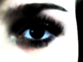
 We then decided to change our image and make sure that the eye in our logo could be instantly recognised. We took another photo of my eye and ensured that it was a clear image that we could use, which is shown to the right. We then manipulated the photo on photoshop by using our previous idea. Instead of using the charcoal filter we decided to use the filter 'Sumi-e', which is similar to 'fresco' but gives a less texturised effect, therefore making the image more clear. We also manipulated the curves, brightness and contrast and the levels of the image to make it more striking. As shown below the original image.