
Wednesday 28 April 2010
Monday 26 April 2010
Evaluation
 Screen shot 1 shows our establishing shots of the house, these shots set the scene for the audience and makes them aware of the setting in which the film is based. You can clearly see that the setting is a house from these images and as they are from a point of view shot a gradual pace is built up, which creates tension and the sense of the unknown for the audience, as it instantly makes them aware that whoever perspective it is being shot from shouldn't be there. These establishing shots also help to explain later events of how Talia is tied up and create a greater awareness of how Joe has power within the trailer as he is free to walk around, whilst Talia is restricted. The low key lighting and the contrast manipulation on photo shop makes the images impacting and more memorable. The reason we began with shots of the setting is because we found that in our research this was a key feature seen in both 'Orphan' and 'Last house on the left', which are our two inspirational trailers from our chosen genre. 'Last house on the left' places establishing shots of the setting before the title in the same way that we do. 'Orphan' uses establishing shots at the beginning, but it also has them towards the middle of the trailer when the tone of the trailer changes. They use short close up shots of areas in a playground that are shown with black outs in between, this creates tension for the audience in a similar way that our shots do. By showing the setting of our shots it immediately appeals to our target audience, which through our research we discovered that our target audience would prefer to see a film based within a domestic setting.
We have placed the production logo after our establishing shots (screen shot 2), we chose to do this as we felt by putting it after footage has already began we have already captured the audiences attention and therefore ensured they are watching. As we are a macro media the advertisement of our production logo is key to ensure we gain a name for ourselves and it is vital that our audience pays attention to it. By placing this here it shows a lapse of time between the establishing shot and the footage that follows after it and it breaks up the flow of the trailer. We saw that this was effective in the trailer for 'The Last House on the Left' as it made it a lot more memorable for us and were inspired for us.
When Sophie is on the bed and there is an over the shoulder shot of her discovering the gory images on the computer (screenshot 3) it makes the audience feel uneasy as it makes it seem as if someone is watching her without her knowledge. The images of gore relate back to chosen genre and reflect the genre instantly. By this point the audience have seen the flashing images of Sophie on the bed and as Sophie is sitting on the bed the audience now know what is going to happen to her and realise the flashing images foreshadow what is to come later in the trailer.
The flashing green images create fear with in the viewer as the colour green makes it appear alien like and strange (screenshot 4). The fake blood and bruising clearly show she is in distress, as the image quickly flashed and the images is blurred it disorientates the audience and makes them confused. The image is shot from a high angled shot, and is meant to reflect it being a point of view shot of the antagonist, this makes her appear inferior to the attacker. She is on a bed which reflects the sinister sexual nature of the attack and helps to explain the narrative. A similar effect has been used in the trailer 'Orphan' to create tension but with in Orphan it reflects a change in time, although our shots are there to create tension they also foreshadow what is to come. The images disrupt the pace of the trailer and make the audience feel uneasy and anticipating what is to come.
We intended for the pan to Bowe in the doorway to create panic and fear for the audience (screenshot 5). We have applied a ghosting pan on the pan to make it appear disorientated as we intended it to be from the point of view of Sophie, this also is likely to make the audience empathise with Sophie. This shot is intimidating as Bowe fills the doorway making him appear large, he also has his hood up and his face is hidden leaving the audience not knowing who he is, this creates impending doom and makes the audience know that sinister things are about to happen. By adding a point of view shot from another character it allows the audience to relate to various characters and involves them in the trailer. It also creates confusion that is later explained through the trailer, by this point the audience is now aware that the initial establishing shots of someone entering the house is the person who is now standing at the door- this creates fear for the audience. Through this shot we can see clearly that it is a domestic setting, this makes the audience relate to the shot and makes it more real for them.
The captions with in the trailer are the same font as the title (screenshot 6), creating continuity between the trailer and making it less confusing for the audience. The captions have a similar effect as the title with the use of the scratch font creating an impacting effect of someone needing help. The black background with white font makes it stand out with no imagery to distract the audience. We have ensured that the captions change in time with the music making them striking. By using a rhetorical question in our caption it makes the audience feel directly involved in the trailer, we have also used the personal pronoun 'you' to appeal directly to the audience and making them feel actively involved in the trailer. This was inspired by the trailer of 'Last house on the left' as with in their captions they have also used personal pronouns to interact with the audience and make the plot more real for them. By making the plot real for the audience we are fulfilling one of the requirements we discovered through our questionnaires, our target audience said that they preferred a plot that had characters that they could relate too and was realistic to themselves. By including captions it breaks up the trailer and shows a lapse of time between the panning shot to the character Bowe and the shots of the character Sophie in distress. This was a convention we saw in both the trailers for 'The last house on the Left' and 'Orphan', the captions where the introduction to scenes of heavy violence and broke up the pace of the trailer making it unpredictable and leaves the audience anticipating what is next. The captions we have used also help to explain our narrative and shows that the heroine is someone who loves Sophie but doesn't disclose who.
The image of the hand shows clear distress and a struggle between two characters (screenshot 7). The setting is the same that the rest of the footage and therefore shows that all previous events shown in the trailer have lead to this point. The variation of shots used make it confusing and disorientating for the audience, we have used a lot of high angled shots to make Sophie look inferior.
Screenshot 8 is our title for our film. We have placed this towards the end of our trailer, as during our research we found that it was conventional to leave the title of the film until the last shots. We decided to use this convention, as we found that it was very effective in making the title memorable, which is important in order for consumers to go and see it. We decided to place the trailer in the second last shot so that after making the audiences heart pace increase, it suddenly slows down with the title and makes the audience want to find out what happened next. This fast past cut abruptly by a title is a common convention with in horror films. The title is center to the shot, this is the place in which our audiences eyes are drawn instantly, as the text is in white with a black background with no imagery there is nothing to distract the audiences attention from the title making it the most impacting thing. We have made 'coming soon' smaller as it is has less significance to the title. The typography is in a scratch style font, similar to someone hand writing. This font also reflects our chosen genre of horror, as it can be seen as reflective of someone trying to escape.
Another convention we found in our research was the use of a memorable clip at the end of the trailer (screenshot 9), usually played after the title. This is seen in both the 'Last House on The Left' and 'The Orphan', where 'The Last House on The Left' plays a scene with a man's head in the microwave and 'The Orphan' uses a scene in which the child jumps out from the bedsheets, which are both very memorable. We decided to use this convention and place a clip after the title, which can be seen in screenshot 9. We decided that instead of using a clip that will scare the audience we wanted to use a clip that created compassion for the character, Sophie. This is very important as we wanted the audience to feel like they should 'rescue' her by watching the film and seeing what happens. This is important in reference to audience psychology, as it is frustrating if they are not able to find out what happens as they are not given a satisfying solution. This can be seen in Walter Fisher's narrative theory, which claims people are essentially storytellers and their understanding of narrative is based on their own good morals. In this case the use of this clip will help to attract an audience as they will be feeling confused until they find out the whole story, so to achieve satisfaction they will need to watch the rest of the film. Various audiences will have different emotions associated with this ending, for males we aimed to make them see the victim as a damsel in distress that needed rescuing, for females we wanted them to empathise with the character Sophie, this makes the audience emotionally interact with our trailer and gain gratification from it. The multiple interpretations of the narrative due to various personal identities and collective identities of this clip make it appeal to a wider audiences, the idea that each individual audience will interpret this ending clip differently due to previous experiences or them belonging to a collective relates to Roland Bathes ball of string theory.
Within our trailer we have used a range of costumes and props to show our chosen genre and appeal to our audience by using conventional props and costumes that the audience can recognise. The character of Sophie is dressed in 'normal' clothing such as a top, jeans and a cardigan. This is important in order to make the character realistic to our audience and therefore make the storyline accessible. We have also dressed the character of Bowe in a hoodie and dark clothing to connote his evil role. This is also relevant to society at the moment as we are reflecting the public concerns with the youth of today as they are presented as intimidating and dangerous to the general public. Lasswell'stheory that media texts have certain functions for the individual and society apply to Bowe's appearance as we are using correlation to reflect present societies concerns. By using our audience's foreknowledge we are able to use these semiotics and keep an ambiguous storyline. We have also used specific props within our trailer to reflect the genre and to add to our storyline. We have used a laptop so that the audience can clearly see the gruesome images that Sophie can also see. This makes the revelation of Bowe's crimes as shocking to the audience as it is Sophie. The laptop also makes the trailer relevant to present day life, as this is a piece of technology that most people have due to the technological advancements within society. The bed is also a common item that many people associate with sleeping and sex, which is a theme we have subverted by making it appear negatively due to the images on the laptop and the use of a rope to tie her up, a gag and bruising and blood on the face later on in the trailer.
 The image above shows a collection of shots from the trailers 'Last House on The Left' and 'The Orphan'. We have selected specific shots that inspired us within our own creation of 'White Lies'. As you can see from the first shot type, there is a production logo shown at the very beginning of the trailer, which you can see from the time line at the bottom of the image. This is seen within our trailer, as we have shown our production logo at the beginning in order to build up tension and capture the audience's attention through anticipation. We have also used captions in our trailer, which our seen within the middle sections of the trailer. This is also true for both of these trailers, as it allows the audience to think and relate it to the footage they are being shown, which gratifies them through cognitive thinking. As you can see from image three, the title of the film is shown last within the trailer with a short clip just after it (image 4 and 8). This is used in our trailer, as we found that this was effective as it is the last text you see, which makes the title very memorable. The last image also is a tease as it gives you an urge to find out what happens, but then the trailer ends which encourage the audience to see the film. In image 5 and 7 there are setting shots, which are seen within our trailer. Image 5 is a domestic setting, which is most similar to our shot of the house. This helps to build the setting up of the film and also makes the film more relatable for the audience as it uses a setting that they can relate to. Image 9 also shows a close up of a distressed young girl, which helps to create a relationship between the character and the audience as you are given an insight to her emotions and the character is also staring directly at the audience. This is also seen in our trailer where we have used close up shots of Talia when she is tied up on the bed looking directly at the camera. At one point she also screams in the camera which is very similar to this image.
ACTIVITY 2- MAGAZINE COVER-
We have used 'impact font' as it is quick and easy to read and is quite stylized and professional, but also reflects a younger audience. The stylized font style also reflects the image itself, which has been purposely styled to reflect the character and actress as one person. This reflects the feedback we received from our questionnaire as many people said that they prefer a simplistic but stylised font. Here is some examples of texts and colour themes we could have used. The bright colours contrast with the image and reflect the young age of the actress therefore supporting the idea of the magazine cover portraying both the actress and the character of the film. We decided to use Impact as we felt that it was easy to read. The colour of the text stands out and matches the colour of the top that Talia is wearing adding continuity.
We inserted the title and placed it behind her head to show that we are confident in the title of our magazine. This also shows that our title is not the selling point for the magazine, which is what we commonly saw in most film magazines that we analysed. The colour was taken from the shades of Talia's t shirt, which creates a simple and effective colour palette that also links back to the image. We ensured that the text which relates to the image was larger than any other text and that we made key words larger or in a colour that stands out more.
The colour theme is simple but effective and links the writing to the image well. The colour peach was taken from her lips and takes away from the severity and possible seriousness of the image, which softens the magazine cover and also links back to Talia as a feminie actress. By not using a bold and bright colour palette, it makes the image of Talia stand out more, which is what we wanted to achieve, as it is such a striking image we didn't want anything to distract the audience from that.
We have used the title of Montage as it is a technical term used with in media. We have included a tag-line that refers to the definition of the magazines title- montage. The tag-line is 'Mixing the hottest and Most Wanted'. This is reflective of the title, as it is the process of piecing together separate parts of the film to make a whole. This is why we have used the word 'mixing' to highlight the titles meaning in the film industry. 'The hottest and most wanted' make the magazine seem up to date and exciting.
We have chosen to dress Talia in clothing that is reflective of current trends for teenagers making her more appealing to our target audience. Her makeup gives a shocking impact but juxtaposes her cheeky pose, the make up helps to connote the gory genre of horror with out it being too sinister and serious. We were most interested in allowing the magazine cover to sell Talia as an actress rather than the film via genre as the magazines we have looked at focused on the leading actors and the plot or genre of the film were less important. This contrast is very effective as we are drawn in through her eyes that grab your attention, which instantly brings attention to her face. This is contrasted with her top which is white lace, that has connotations of innocence and purity. However as it is see through it shows her rebellious and seductive side of her character and also her as an actress. Her pose is also very seductive as she has her legs open and is looking up at the camera trying to gain the audiences attention, which contrasts with her bloody face as you would expect her to look sad or in pain. She is in the centre of the magazine cover and therefore is the focal point, the text is placed around her again reflecting her importance. By placing her in front of a brick wall it makes the image edgy and 'urban' reflecting how the film is set in an urban domestic setting rather than a rural domestic setting. The dirty brick wall makes her stand out more as her skin is clean and crisp making her look more pure.
POSTER-
In our poster we have used a conventional layout by using a central image to capture the audience's attention. We have also placed the text at the bottom of the poster, which is conventional, as in our research we found that the text on the poster is usually placed at either the top or bottom part of the poster. We have also put 'Coming Soon', which is conventionally in film posters so that the audience can identify that it is a film and can lookout for the release of the film. We have also Incorporated the production logo and the film certification on the poster to reflect that it is advertising a film.
This image is effective as the positioning of the hand looks as if its coming to wards you. It fill the majority of the shot and is centered therefore making it eye catching. The lighting has worked as the flash has reflected on some of the writing making it stand out.
We have used varied text within our poster. The title of the film was written in blood on the hand of our main image. This is very unusual and stands out, and as it is on the central image it draws more attention to it. This also makes the title of the film obvious to the audience, which is important for them to gain recognition of the film. In our text we have used the same 'scratch' font that we have used in the trailer in order to create synergy between the different mediums of advertisement. In our tagline we have also used a bigger size font on the word 'hurt' to emphasise the themes of violence in our film.
We wanted to use a hand to represent the girl pleading for help. We decided that as the main image we would put the title on her hand in blood to create a bigger impact. By using blood on the hand for the title it creates a unique way in displaying the title of the film, which will help our poster to stand out. The genre of horror is clear through the image of blood and low key lighting, which are conventions of the horror genre. This will help to attract an audience that is interested in horror films, which are part of our target audience. The simplistic poster creates a greater impact as people can focus on the image. We have used a limited colour palette of red, black and white. The colours of red and white are very ambiguous and create alternative meanings of the poster. These colours also contrast with the black background, which has universal connotations of evil and the unknown, which are themes our film portrays.
The price for our magazine cover is £2.50. This is suitable for our target audience as they said they are willing to pay between the price of £2-£3 for a film magazine. This means that our target audience will be more likely to purchase this magazine, which increases our chances of high sales.
It is important that when creating our magazine cover we are able to connect a range of types of media together. This is seen in our website on the magazine cover. This enables us to communicate with society as we live in a media saturated world. It also enables us to target our audience as they stated they are interested in technology. This is important in creating a hype about the magazine as there are many forms of media that the consumers can use dependent on what is most suitable for them. It also provides an interaction between the business and the consumers, which is important in creating a good relationship and making customers loyal. We also wanted to create character profiles on facebook and myspace to create an accessible form of promotion for young adults as social networking is very popular at the moment. This is interactive and also helps to build a hype about the film.
At the bottom of the cover, we included bullet points about the content of the magazine to give people a brief overview. This ensures that people can instantly see if the magazine covers things that they are interested in and therefore will attract the right audience. We also included a barcode to make it look realistic and of a professional quality.
From our questionnaire results we ensured that our magazine cover was monthly, which we portrayed to the audience by displaying 'April 2010' above the barcode. We have also included a striking image to attract customers attention and stand out against its competition. Our magazines target audience is aged between 16 and 20, which means we can include reviews of films certified 18. As out target audience is interested in technology we have included this on our cover such as Adobe Elements Review. We have also featured up and coming artists, as our audience is more interested in individual production rather then the mainstream. We haven't included any freebies as our results showed that they would not be interested in this. he results also showed that our audience preferred the genre of horror, which is why we have used an image from a horror film and have also reviewed horror and action films, which was the second most popular genre.
Evaluation activity 3-
we feel that from our ancilary products we have learnt alot- we have learnt to be more aware of the conventions with in genres, and to take these into consideration more when creating a final product. Through deeper research this understanding has become clearer and audience feedback and participation in our research is vital because with out an understanding of what the audience wants there would be no purpose for our product. Our technical skills have improved and we have learnt to use new programmes such as adobe elements and learn more about photoshop to create a more profeshional outcome, we have become more experimental in our ideas and have encorperated special effects such as make up. With a greater understanding of the rule of thirds and photography and camera work as a whole we included shots from various angels and positions making our project more interesting and less bland.
From our first magazine cover we have learnt to amalgamate more than one image into our final cover through creating a background in comparison to our annicilary project where we both used a close up of a face. Although we have used similar conventions as we did carry out research into magazine covers for our anncillary project, we have been more thorougher in our research this year making our product more professional.
When carrying out our shoots for both the trailer and the poster and magazine we have learned to not just stay to our plan and to do more experimental shots so it left us with a wider selection of imagery and footage to work with in the editing stages.
Although the theme of our projects has changed from a music magazine to a campaign for a film the same techniques apply to appealing to an audience. As a music magazine is confined to one product we didnt consider continuity however when we created our campaign we had to consider further how each individual element related to each other through synergy.
Activity 4-
After our final editing of our trailer we presented our traileron a large screen in front of our media class, consisting of people aged between 17 and 19. This is effective feedback as these people are in our target audience and we are catering for their needs.
The class presented us with negative and positive comments about the trailer and helped us to see our trailer from another point of view. Here are the positive reflections werecieved from the class:
- Good use of colour and contrast in the flashing images
- Good length for a teaser trailer
- Engaging for the audience
- Presents a plot, but also leaves enough mystery that the audience want to see it
- Emotive as it provoked empathy, fear and sadness
- Instant awareness of the genre
- Good logo
- Music helps to create an emotive atmosphere and fits the genre
- Good and appropriate use of audio including the phone call and one section of filming with audio
- They felt that the music and the flashing images relate well to other films with in the horror genre, and when we asked what genre they felt the film belonged too all participants said horror.
Here are the constructive comments we recieved from the class:
- The phone call could have two rings instead of three as the screen is black for a long time
- The green flashes could be extended to show the audience that it is the main character
- The title could be extended slightly
This feedback will help us in our final editing and to meet our target audiences needs. It also helps us to see ourtrailer from a consumers point of view instead of the creators
After recieving our class feedback we decided to edit our trailer for the final time. We decided to act on our consumers response and extended the trailer title and shorten the phone call to two rings. Another comment was that the screen was black for a while, so we decided to add a flashing image of our main character Sophie on the beat of the two rings. We also extended the green flashes during the exposure of the images, however we only extended them slightly, otherwise the images don't carry the same impact of surprise and confusion. We also then showed our peers the changes to see if it matched their expectations. The feedback we recieved was extremley positive and had the desired impact we intended.
We then exported our trailer and imported it onto youtube so that it is an accessible format for people to watch it.
1. They felt that the initial flashing images of the beaten girl were too short and could be slightly longer but we felt these shot where unnecessary and limited the effect of the flashing images later so we decided to remove these and replace them with establishing shots of the setting.
2. They felt that the pan in the middle of the trailer to the man in the door way was amature and suggested we either re-shot or worked with this clip. We decided to apply a ghosting effect to make it appear more professional, which disguised the jolt in the middle of it.
3. They suggested a possible change of music, but we had previously experimented with this and it was unsuccessful.
4. They felt that the narrative wasn't clear and suggested using establishing shots. We decided to take photographs of the house (the setting of the trailer) from the perspective ofBowe, the antagonist of our film. We gradually built up the pace of these shots through the beginning of the trailer to add tension. This makes the audience aware that it is set in a domestic setting, this is important as we discovered with in our research that our audience preferred a storyline set in a domestic setting. By including these establishing shots it also gives meaning to the last shots as it explains that someone has entered the house and that is who is at the doorway.
Poster:
After completing our final poster, we presented it to our peers in order to gain feedback on any final changes.
Our peers said:
- They thought the red nails worked effectively, as it projected a scary image of entrapment and also the colour of red connotes the colour of danger and blood. The red nails also help to present a feminine character, which helps to narrate our storyline.
- The title of 'White Lies' stands out on the poster as behind the title it has a bright colour palette. The title is also in the middle of the page which clearly shows that it is the title.
- The 'Coming Soon' was in red, which links it to the title because of the colour of red. This worked effectively as it drew your eye to the title and to the phrase 'Coming Soon', which helped you to instantly recognise it as a film poster.
- The background is black, which our peers thought was effective as it made them question what was behind the hand. It also helped to create a sense ofuncertainty and a fear of the unknown. It also intrigued people into the poster, which will entice them to find out more by watching the film.
- They also commented that the genre of horror was very clear due to the motif of blood, the colours, thetagline and the image.
- There was a narrative enigma, which intrigued people into the storyline and and attracted them to the film to find out more.
- They liked the fact that 'hurt' was bigger then the rest of the tagline, as it drew emphasis to the theme of violence and made them want to find out what happened.
- They also liked the heavy contrast in the image as it made the image more defined, which attracts the eye to the poster. It also highlights the main theme of violence and emphasises a struggle.
- They also like the colour palette of the poster, as the only colours featured on the poster are white, black and red. They liked the simplicity in the colours, however they felt that these colours created a bold impact on the audience as they contrast well and also reflect the themes of the film.
- They felt that the bruising and the blood on the hand were created well and looked very authentic. This also emphasised the main themes of violence, as people associate blood and bruises with danger.
- Our peers also stated that they thought our poster overall looked very professional. This is important to create a higher status for our film and to ensure that people can relate it to the macro media. This is important as it will encourage people to relate our film with macro media and encourage them to see something that they think will be of a similar quality.
Myself and Ferne gathered a group of people together who were students at Walton High aged between 17-18 years old. We decided on this age range as it is a suitable demographic from our target audience therefore the information we gain is valuable.
The majority of people felt that the hand in the centre wasextremely effective, and individual. They felt that it clearly portrays our genre through the scratchy writing and blood, and that it is effective. They felt that the title was clear, and that the red and white colour theme works really well and that everything with in the poster compliments each other, and everything has a purpose and no space is wasted. They felt that the black background makes the hand stand out and makes the poster more striking and eye catching. We showed them the original image and they felt that it looksalot better with out the writing saying 'coming soon' on the hand. There was a few criticisms, some people felt that the fingers looked computer generated, and the image is a bit too depressing. A few people found that the writing could of been messier, that the word 'hurt' is too big and may create confusion for the audience on what the title is. Some people found that the writing at the bottom is too small and that more members of the cast and information about the film should be added in. Other people felt that the audience may not understand why we have used the image and the relevance it has too the title, or what other advertisementsthey should look out for in other media. Although thesecriticisms are valued alot of things they criticised where things we created on purpose, and many of them didn'tunderstand the difference between a micro and a macro film creation and the effects it has on the campaign. We have concluded that the cast is irrelevant for our trailer as we have no leading actors or actresses, that's why it is very small and many people didn't notice it. The fact that they felt they couldn't work out what the film was about from our trailer was our intended effect as we wanted to create a narrative enigma and therefore make our audience question what they see, creating the 'buzz' before and therefore creating audience gratification. Some people have provided constructive criticisms that we could follow up on, but it was a minority of people who stated these improvements and therefore if we changed it, we wouldn't be pleasing the majority, as the majority said they preferred it as it was.
Magazine cover:
After completing two possible designs for our final cover we carried out a focus group to gain peoples opinions and ask which one they preferred. The majority of people said that the cover with the dark red writings image was too dark. They felt that the colour palette was dull and it made the image not stand out, and that you loose definition of edges of the actress, and there is less blood visible. They felt that her skin looked horrible and it looked alot nicer and fresh on the other version. They felt that the image looks alien due to the blue toned skin, and the areas of blue blood, they said that it portrays a sci-fi based film/ mystical film based on vampires etc, this is obviously not the impression we want our target audience to have of our cover as it is the wrong plot. The fact she appears alien makes the audience feel like they can relate to her and this detaches them from the cover and decreases the likelihood that they would purchase the magazine.
They felt that the cover with the white writing is more successful due to the fact she stands out more as she is bright and colourful and the background is dull. They felt that the blood looks alot better, and the image looks more seductive. The edges are alot smoother around her head. The blood looks seductive and that the colour of it is vibrant and stands out. The image appears more comical and less sinister with the brighter colour influence which is good as this was the aim of our image, to be sinister with a quirky edge. They liked the fact the writing links to the top and makes the writing relate and combine with the image rather than being two separate components.
- The pose of the model is very successful as she draws in the reader because she is leaning out to the audience and looking at you. This helps to attract our audience, which will increase our sales and show that it is a successful presentational device.
- The colouring of the coverlines are attractive and very interesting in comparison with the harsh image. However there are some words which are harder to read because of the background.
- The title stood out and was thought of well. It helps to convey the magazines identity by showing that it covers different subject matters and is a visual image for a visually themed magazine.
-By having a slightly glamourous shot of the character it looks like magazines that you would buy as magazines glamourise women
- They also thought that there was a good cross section of subject matter. However they believed that not all readers would know what adobe was and thought we could have used a more well known technological subject as acoverline.
From this focus group we can clearly see what our audience prefer to see, many of them said the initial one wasn'tappropriate for a magazine cover, as most images on magazine covers are glamorous and therefore the 1st designdoesn't suit the conventions and what people are expecting to see. It is vital that we appeal to our audience effectively and although we wanted to create an unusual and quirky cover, we have to still ensure it appeals to an audience to maximise profits and sales. We have listened to our audience and created something that they are happy with and is in keeping with our initial research into our target audiences expectations
Activity 5-


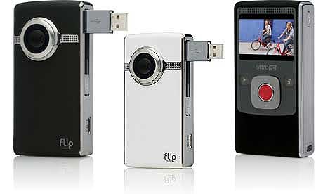
Here is images of technoligy that I have used. Here you can see screen grabs from Adobe Premiere Elements, Adobe Photoshop CS3, Youtube, Blogger, A optiplex 755 computer, Flip's UltraHD camera and a Nikon D300.
These peices of software and hardware have influenced our project very heavily. Using the cameras we captured both our footage and our photos for our project. We edited the footage in Adobe Premiere Elements and our photos in Adobe Photoshop CS3. If technology were not so advanced we would be met with a several problems. For example:
-The whole process would have taken longer as we would have had to film onto a film reel and cut and splice it ourself, instead of being able to film it and being able to edit it instantly by uploading it to a computer.
-We would have been unable to use a HD camera. Hd cameras are so much more effective than the standard DV cameras, they produce a much higher quality of video improving the overall look. Using DV cameras produces a much more grainy image quality.
-By using Youtube we were able to broadcast our products to a large audience. It stopped it from being a local audience and it became viewable worldwide. Without youtube we would have had to show it to an advertiser to get it public in any way as well as leaflets and posters. By using youtube we could easily show it to an audience and gain feedback and improve our trailer. Blogger enabled us to track progress and evauluate and talk about our project as we were making it. By uploading our posters and magazine covers to blogger we were able to show it to our audience and again gain feedback and make improvements. If we couldnt of done this we would have to have gone around to people with a hard copy. Overall technology has made the whole process faster and easier for us.
Saturday 17 April 2010
Feedback On Our Magazine Cover
In order to see if our magazine cover was successful, we decided to run a focus group. This meant we gathered people from our target audience, showed them our magazine cover and collected feedback on aspects they thought were successful and aspects which could be improved. The overall feedback was:
- The pose of the model is very successful as she draws in the reader because she is leaning out to the audience and looking at you. This helps to attract our audience, which will increase our sales and show that it is a successful presentational device.
- The colouring of the coverlines are attractive and very interesting in comparison with the harsh image. However there are some words which are harder to read because of the background.
- The title stood out and was thought of well. It helps to convey the magazines identity by showing that it covers different subject matters and is a visual image for a visually themed magazine.
- They also thought that there was a good cross section of subject matter. However they believed that not all readers would know what adobe was and thought we could have used a more well known technological subject as a coverline.
Wednesday 7 April 2010
Focus Group on Two Magazine Cover Designs

After completing two possible designs for our final cover we carried out a focus group to gain peoples opinions and ask which one they preferred. The majority of people said that the cover with the dark red writings image was too dark. They felt that the colour palette was dull and it made the image not stand out, and that you loose definition of edges of the actress, and there is less blood visible. They felt that her skin looked horrible and it looked a lot nicer and fresh on the other version. They felt that the image looks alien due to the blue toned skin, and the areas of blue blood, they said that it portrays a sci-fi based film/ mystical film based on vampires etc, this is obviously not the impression we want our target audience to have of our cover as it is the wrong plot. The fact she appears alien makes the audience feel like they can relate to her and this detaches them from the cover and decreases the likelihood that they would purchase the magazine.

They felt that the cover with the white writing is more successful due to the fact she stands out more as she is bright and colourful and the background is dull. They felt that the blood looks a lot better, and the image looks more seductive. The edges are a lot smoother around her head.
the blood looks seductive and that the colour of it is vibrant and stands out. The image appears more comical and less sinister with the brighter colour influence which is good as this was the aim of our image, to be sinister with a quirky edge. They liked the fact the writing links to the top and makes the writing relate and combine with the image rather than being two separate components.
From this focus group we can clearly see what our audience prefer to see, many of them said the initial one wasn't appropriate for a magazine cover, as most images on magazine covers are glamorous and therefore the 1st design doesn't suit the conventions and what people are expecting to see. It is vital that we appeal to our audience effectively and although we wanted to create an unusual and quirky cover, we have to still ensure it appeals to an audience to maximise profits and sales. We have listened to our audience and created something that they are happy with and is in keeping with our initial research into our target audiences expectations.
Analysing our Magazine Cover

To create this magazine cover we initially sourced an image of a brick wall from the internet and placed it into a document.

Then by using the transform skew tool we manipulated the image so that it made the wall sit at a different angle. This was necessary due to Talia's positioning otherwise the image would have looked unnatural and fake. We then found an image of a tarmac floor, which we placed in the same document, underneath the wall layer. Then through using the magnetic lasso tool we selected Talia and dragged her over to the document with the wall and tarmac floor. We had to adjust the size of the image to make sure it fitted well in comparison with the sizing of the whole cover. By using the smudge tool we were able to neaten the edges around Talia, so it looked like the image was taken in these surroundings. We then began adding shadows, to make it look like she was on the floor. To do this we selected an area with the magnetic lasso tool then using a paint brush tool with a soft edge to it and minimum opacity we painted in undeneath her legs etc, the lasso tool made sure we didnt paint over talia herself.
We then enhanced the images brightness and contrast and colour balance. Using the magnetic lasso tool we selected her eyes and enhanced the colour of them to make them a bright blue that stood out more in the image.
We have used 'impact font' as it is quick and easy to read and is quite sylized and professional, but also reflects a younger audience. The stylized font style also reflects the image itself, which has been purposely styled to reflect the character and actress as one person. This reflects the feedback we recieved from our questionnaire as many people said that they prefer a simplistic but stylised font. Here is some examples of texts and colour themes we could have used. The bright colours contrast with the image and reflect the young age of the actress therefore supporting the idea of the magazine cover portraying both the actress and the character of the film. We decided to use Impact as we felt that it was easy to read. The colour of the text stands out and matches the colour of the top that Talia is wearing adding continuity.

We inserted the title and placed it behind her head to show that we are confident in the title of our magazine. This also shows that our title is not the selling point for the magazine, which is what we commonly saw in most film magazines that we analysed. The colour was taken from the shades of Talia's t shirt, which creates a simple and effective colour palette that also links back to the image. We ensured that the text which relates to the image was larger than any other text and that we made key words larger or in a colour that stands out more.
The colour theme is simple but effective and links the writing to the image well. The colour peach was taken from her lips and takes away from the severity and possible seriousness of the image, which softens the magazine cover and also links back to Talia as a girly actress. By not using a bold and bright colour palette, it makes the image of Talia stand out more, which is what we wanted to achieve, as it is such a striking image we didn't want anything to distract the audience from that.
We have included a tag-line that refers to the definition of the magazines title- montage. The tag-line is 'Mixing the hottest and Most Wanted'. This is reflective of the title, as it is the process of piecing together separate parts of the film to make a whole. This is why we have used the word 'mixing' to highlight the titles meaning in the film industry. 'The hottest and most wanted' make the magazine seem up to date and exciting.
The price for our magazine cover is £2.50. This is suitable for our target audience as they said they are willing to pay between the price of £2-£3 for a film magazine. This means that our target audience will be more likely to purchase this magazine, which increases our chances of high sales.
It is important that when creating our magazine cover we are able to connect a range of types of media together. This is seen in our website on the magazine cover. This enables us to communicate with society as we live in a media saturated world. It also enables us to target our audience as they stated they are interested in technology. This is important in creating a hype about the magazine as there are many forms of media that the consumers can use dependent on what is most suitable for them. It also provides an interaction between the business and the consumers, which is important in creating a good relationship and making customers loyal. We also wanted to create character profiles on facebook and myspace to create an accessible form of promotion for young adults as social networking is very popular at the moment. This is interactive and also helps to build a hype about the film.
At the bottom of the cover, we included bullet points about the content of the magazine to give people a brief overview. This ensures that people can instantly see if the magazine covers things that they are interested in and therefore will attract the right audience. We also included a barcode to make it look realistic and of a professional quality.
From our questionnaire results we ensured that our magazine cover was monthly, which we portrayed to the audience by displaying 'April 2010' above the barcode. We have also included a striking image to attract customers attention and stand out against its competition. Our magazines target audience is aged between 16 and 20, which means we can include reviews of films certified 18. As out target audience is interested in technology we have included this on our cover such as Adobe Elements Review. We have also featured up and coming artists, as our audience is more interested in individual production rather then the mainstream. We haven't included any freebies as our results showed that they would not be interested in this. he results also showed that our audience preferred the genre of horror, which is why we have used an image from a horror film and have also reviewed horror and action films, which was the second most popular genre.
Our Four Final Images
Here are the four images that we have narrowed our photoshoot down to. We took two photos where half of her face is normal makeup and the other half is covered in blood and bruising and we have two photos of her whole face in blood and bruising. We thought these photos were the most effective images as you can clearly see the contrast in herself as an actress and as her character through her makeup and her body language.

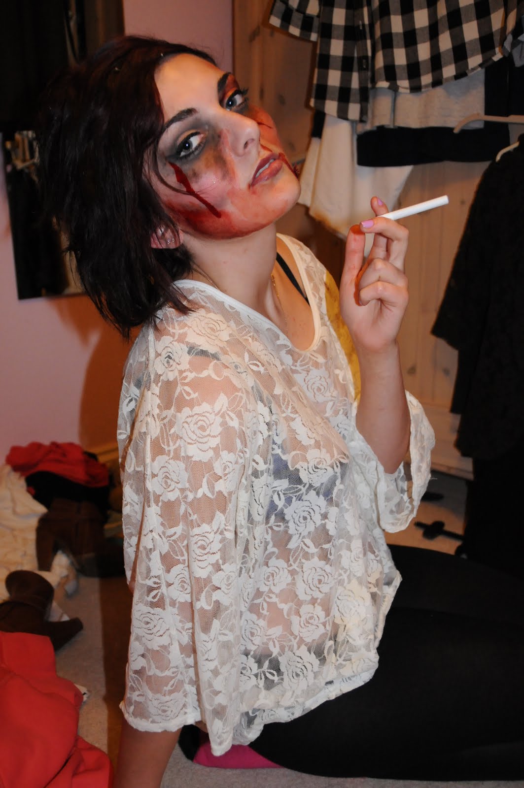
This is one of our favourite images as her makeup gives a shocking impact but juxtaposes her cheeky pose. This contrast is very effective as we are drawn in through her eyes that grab your attention, which instantly brings attention to her face. This is contrasted with her top which is white lace, that has connotations of innocence and purity. However as it is see through it shows her rebellious and seductive side of her character and also her as an actress. Her pose is also very seductive as she has her legs open and is looking up at the camera trying to gain the audiences attention, which contrasts with her bloody face as you would expect her to look sad or in pain.
 This image is similar to the one above however this image isn't as playful as the other one, as her facial expressions are more serious with a slight smile, which could be interpreted as more manipulative.
This image is very stylised and uses a clear shot of the different makeup, which identifies the actress and the character. The pose of Talia is with her head tilted back, which is a very glamorous and sexualised shot to emphasise the detachment from her character and the bloody make up. We have also used the white lacy top with her shoulder out on the side of her made up face, which also emphasises the glamour associated with the career of an actress.

This image focuses on Talia's face, which allows us to have a close up view of her make up and her facial expression. Her facial expression is cheeky with her tongue out on the side of her glamorous face and she also has a smile, which contrasts with the bloody bruised side of her face. This shot is also face on, which shows a clear contrast between the actress and her character. We felt that her outfit would have looked better with the white lacy top to emphasise the difference.

This image focuses on Talia's face, which allows us to have a close up view of her make up and her facial expression. Her facial expression is cheeky with her tongue out on the side of her glamorous face and she also has a smile, which contrasts with the bloody bruised side of her face. This shot is also face on, which shows a clear contrast between the actress and her character. We felt that her outfit would have looked better with the white lacy top to emphasise the difference.
Tuesday 6 April 2010
Our Photoshoot
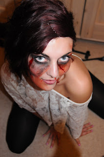
For our photoshoot we wanted to portray the actress and the character as one person. We wanted to used a clear divide between the two and came up with the idea of using different makeup. We first of all did half of Talia's face in makeup of bruising in blood, which is seen in the trailer and also in the poster of the film. We then did half of her face in blood and bruising in contrast with girlie makeup to reflect the actress. We also then made her full face in blood and bruising contrasted with fun, sexy shots to reflect the actress in a shocking way. We also took some shots with a cigarette to show her rebellion and we could also draw on comparisons with iconic Marilyn Monroe images and use that as the actresses inspiration.


Half of face blood and bruised and half with girlie makeup:


We wanted to encorporate the character as it is a micro media production we can't rely on the actresses reputation to sell the film. The shocking images of Talia bein beaten up are used to grab people's attention and relate it to the character. We took some photos in which her expression was sad and serious to reflect her character, but we felt that by using fun and cheeky expressions we can reflect the actress and create attention of the film by creating controversy.
All of face blood and bruised:


Marilyn Monroe cigarette inspiration shots:


Half of face blood and bruised and half with girlie makeup:


Subscribe to:
Posts (Atom)