The marketing campaign of ‘Bruno’ is very shocking, abrupt and controversial. The viral campaign on the Internet is huge. The promotion campaign is hitting their young target audience of 16-45 extremely well by targeting social networking sites such as Twitter and Face book. MySpace also allows their customers access to exclusive black curtain screenings. This allows them to receive information that is easily distributed and accessible by a wide range of people. The trailer for Bruno is also accessible via YouTube, which is an easy way for people to see what the film entails. The controversy of the film will automatically get people talking about the film and will raise awareness of it publicly, which achieves free publicity. However it is always a risk that the publicity is not always good. The website offers advanced tickets for the film and provides latest news for the film. It also has a link to T-shirts that have famous quotes from the movie, which is also a form of promotion. The use of the reference to ‘Borat’ helps to ensure that previous fans will want to see this movie as well, as they can clearly see it is the same actor and will contain shocking topics such as the previous movie. The use of ‘Taboo’ issues is shocking but also comical as humans naturally feel like they want to bend the rules, which this movie offers them an opportunity to experience. The major success of the move ‘Borat’ also plays a part in the marketing campaign of this movie as they are ultimately saying if you like that movie you will like this one as well. The use of the ‘Homosexual’ Austrian man helps to separate the character from society, which is comical as what the audience know as socially expectable they see the character violate. However the sexual scenes in the movie have caused the BBFC to raise the rating to an 18, which will restrict a huge amount of their target audience.
Saturday, 11 July 2009
Overall Analysis Of Marketing Campaign
Friday, 10 July 2009
Importing an Image
This is the poster for the film 'Bruno'. I uploaded this image through pressing the icon of 'Add Image'. It then came up with add an image from the computer or add an image from the web. I was importing an image from the Internet, so i copied and pasted the URL address from the web page that contained the image of the 'Bruno' poster. After pasting the URL address, I then pressed a button labelled 'upload to blog'. Then after a few moments another button appeared labelled 'done', which would then allow the image to be published within the blog. I was then returned to my original blog with the image appearing on the left hand side. Although if you want to move the image's place within the blog you can double right click on the image and then move it to where you think is suitable.
This poster is advertising the highly controversial film 'Bruno'. The poster shows subtle controversy in the poster, which is in contrast to the shocking trailer. The poster appears very simple, which could be due to the wide audience that will have access to the poster and can therefore not offend people, as many people that see the poster will be outside of their target audience. However the poster is still able to spark shocks from people due to the mise-en-scene of the poster. Bruno's appearance is very camp due to the short bright yellow shorts accompanied with a matching hat, leather wrist cuffs and a very pampered face with the appearance of make-up. This may shock some people as it is not the stereotypical image of a man, but the stereotypical version of a homosexual man. Bruno's appearance also contrasts with the background of flowers and clear skies, which have natural connotations as homosexuality can be seen as going against the laws of nature. This challenges social norms and ideologies and can therefore make some people feel very uncomfortable, which portrays the controversy of the film. The film Bruno depends on the reactions of the audience for the film to create word of mouth, which is a major promotional scheme for the films publicity.
The text in the film also play a major role in attracting the target audience. Above the title of the title of the film is text which displays 'Sacha Baron Cohen', this is because it is the actors name playing the protagonist. Sacha Baron Cohen has also played many other roles in films and is used to attract his fans and people who appreciate his work. A leading role actor also secures the film, as it shows that the film is potentially good as the actor is associating their reputation with it. There is also text underneath the title of the film which displays 'Borat was so 2006'. This also will attract fans of the film 'Borat', as it is implying that this film is better than 'Borat', it will also attract fans of 'Borat' because the leading actor is the same. This text is displayed in red, which stands out from the other white writing. In the text the word 'so' is in italics, this suggests that there is emphasis on that word. This is also stereotypical of a camp person as they are portrayed as over using words such as 'so and 'really'. This also reinforces the message of controversy within homosexuality.
Conventions of Genre In Trailers
During our research of movie trailers, the class was split into groups to research conventions of a specific genre, which they can then reteach to the class. This will help us to become aware of conventions that different genres have, which we can then use when creating our own movie trailer in order to portray the genre professionally.
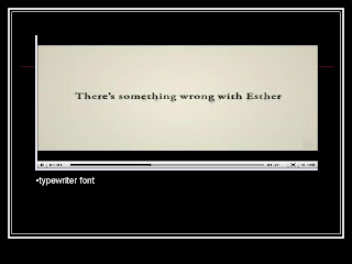
My group consisted of myself and Ferne. We investigated the genre of horror and stated what we expected the trailer to contain and what effect that had on the audience. We then used two trailers, 'The Orphan' and 'The Last House On The Left'. We then annotated three stills from each trailer and showed how it contained the conventions of the genre.
After presenting our research and watching everyone's research it has helped me to become aware of different conventions that are evident in different genres. This will help me when creating my own trailer, as i can use the conventions to ensure that the genre of my film is clear and shown professionally.
Subscribe to:
Comments (Atom)


